 SCREENINGS:
15 SHORT FILM FESTIVAL - Charlotte, USA
Sunday, October 17th - 6:30PM - Evening Muse - Film festival
Festival Program - Film Information
REEL 2 REAL INTERNATIONAL FILM FESTIVAL FOR YOUTH - Vancouver, Canada
Friday, April 16th - 9:30AM - Roundhouse Community Centre - Film festival
Festival Program - Film Information - Festival Schedule
2D OR NOT 2D ANIMATION FESTIVAL - Seattle, USA
Saturday, December 5th - 4:40PM - Film festival
Festival Program - Promotional post about Higher Education
Winner of a Golden Pencil Award for Student Animation!
SHORT SHORT STORY FILM FESTIVAL - Various sites, USA
Saturday, November 21st - 9PM - Film festival
Think Coffee
248 Mercer Street (@West 3rd)
New York, New York USA
Saturday, November 28th - 3PM - Film festival
Saturday, November 28th - 9PM - Film festival
Cable Car Cinema
204 South Main Street
Providence, Rhode Island USA
Festival Info - "Headtrip" Program
MOVING IMAGE FILM FESTIVAL - Toronto, Canada
Saturday, October 17th - 4PM - Giggleshorts Theatre - Film festival
Event Scheduling - Animania: East vs. West Showcase
Showcase Winner!
BOGOTA FILM FESTIVAL - Bogota, Colombia
Friday, October 2nd - 2:00PM - Teatro el Parque - Film festival
Tuesday, October 6th - 1:00PM - Biblioteca Nacional, Auditorio Aurelio Arturo - Film festival
Tuesday, October 6th - 2:00PM - Teatro el Parque - Film festival
Thursday, October 10th - 8:30AM - Teatro el Parque - Film festival
Festival Listing - Spanish Higuer Education - Hernando talks about the film
LA SHORTS FEST - Los Angeles, USA
Wednesday, July 29th - 3:15PM - Film festival
Film Program (The video link does not work)
JALLOO FESTIVAL OF ANIMATION AND GAMING - Miramichi, Canada
Wednesday, June 10th - Thursday, June 11th - Film festival
SHERIDAN ANIMATION SCREENING @ BLOOR CINEMA - Toronto, Canada
Tuesday, June 9th - 7PM - Theatric public screening
Wednesday, June 10th - 9:30PM - Theatric public screening
Mark's List of Films at the Bloor Screening - TRAILER
PRIVATE SCREENINGS @ SHERIDAN COLLEGE - Oakville, Canada
Thursday, April 23rd - 3-4PM S235 - Third year screening
Friday, April 24th - 2-6PM S235 - Open screening
Monday, April 20th - 9AM S235 - Test screening
... and more to come!!! Good job guys!
HIGHER EDUCATION
1 commentsPosted by Amber Gail at Friday, April 17, 2009
3 more days!
0 commentsKeep it going guys! It's tight but between the ten of us we can do it.
If you find there is anything you need to do your work which you do not yet have WRITE IT DOWN immediately! SPEAK TO SOMEONE about it asap about it so we can make sure it is in your hands for you when are ready for it. Thinking ahead here is key! It is essential for you to LET OTHERS KNOW.
Three days means you have one each for scanning, colouring, and compositing - so if the clean animation for any of your scenes are not done yet you best be juggling the work! Get others to help you and offer to help others. If you find yourself sitting around please ask your group members if they are in need of your assistance.
Communication is important here guys, let's work smart. We can pull miracles out of our rears and amaze ourselves with how much we can do when it's down to the wire!
...not that anyone has time to check the blog right now, hah.
Posted by Amber Gail at Wednesday, April 08, 2009
Labels: Words of Wisdom
Ecks Cleanup Tips & Reminders
0 comments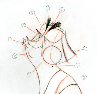 Her nails are also coloured in with graphite. Be careful about her hand proportions - her fingers should NEVER be longer than the plam of her hand.
Posted by mélanie daigle at Friday, March 27, 2009
Labels: CHARACTER - Ms. Ecks
Titles pt.2
0 commentshttp://www.ambergail.com/pp/TitleTest01.mov
RC to dl or play it off the server, makes no difference to me.
I did play with the "correction" of the title but it's my professional opinion that it looks stupid and eats up time.
Not the exact length of the scene, but I'm still going to play with how it fits with the surrounding scenes and the transition to and from black.
Hopefully this sparks a little more discussion! Don't make me email you!! Hah.
Posted by Amber Gail at Sunday, March 22, 2009
Titles and credits
1 commentsI feel we should have a real discussion about this, however brief.
End credits - how do we want to do this? Who would we like to thank? Are they really going to be as long in the final cut as they are right now?
I would like to design them to match the titles.
This is what I have done up for the titles today -

Posted by Amber Gail at Sunday, March 22, 2009
Labels: Art Direction
Leica 8
0 commentsHere is the Pose Test Leica.
The sound effects might be off synch in some parts
Posted by Hernando Bahamon at Saturday, March 21, 2009
Why is she so happy?
0 comments
BECAUSE IT'S FINALLY SPRING!
My e-mail got cut short because I pressed "Send" instead of "Save". Still had a bit more to say, but I didn't want to be flooding you with emails. Because I know I'll think of more. Also, we should all know about feeds since Wednesday's great demo.
Fifth is a reminder to remember those ABCs. As in, don't touch the Cs before you touch the As.
Sixth is a reminder that the pipeline is being supervised. If your roughs aren't in by end of day Monday, I'll want to know when they'll be in, not why they aren't.
Seventh is a reminder to have fun, of course.
Posted by mélanie daigle at Friday, March 20, 2009
Labels: Production
Title sequences: the good stuff
2 commentsForget the film, watch the titles - SubmarineChannel
Lots of good quality digital video of animated title sequences on there. I'm browsing to research title design, I swears it!
Doesn't have much to do with our film, really... other than, like our film, being totally awesome.
The Danse Macabre in a form I can get behind.
I loves me some Gattaca and it pleases me greatly to read the only digital element of the sequence was for setting some type - suck it Dexter.
The obligatory David Lynch!!
Also, more for curiosity's sake than me actually wanting you to watch them - two more by Cuppa Coffee.
Posted by Amber Gail at Wednesday, March 18, 2009
Labels: Inspiration - Film
Scene 65 - poses, take 2
0 comments
Scene 65 - poses from Mélanie on Vimeo.
Posted by mélanie daigle at Monday, March 16, 2009
Labels: Pose Test
Scene 97 - poses, take 2
0 comments
Scene 97 - poses from Mélanie on Vimeo.
Posted by mélanie daigle at Monday, March 16, 2009
Labels: Pose Test
Scene 99 - poses, take 2
0 comments
Scene 99 - poses from Mélanie on Vimeo.
Posted by mélanie daigle at Monday, March 16, 2009
Labels: Pose Test
Scene 95 - poses, take 2
0 commentsI figure I might as well make my own account, hahaha... I made my videos private, just in case. Call me paranoid. So you'll need the group account to see them *hint hint*, haha...
Scene 95 - poses from Mélanie on Vimeo.
Posted by mélanie daigle at Monday, March 16, 2009
Labels: Pose Test
Des Colores
1 commentsPosted by Amber Gail at Tuesday, March 10, 2009
Labels: Art Direction, Colour
pose test galore
0 comments
In case you didn't show up today, or didn't see me while I was shooting some more later on. I'm not happy with a lot of this, seems like I always need at least 2 goes before things start to look kinda like I want them to. So happy DQ's back this week!
Posted by mélanie daigle at Friday, March 06, 2009
Labels: Pose Test
Scene 41 and 52 (almost finished)
1 commentsDidn't bother uploading this one on Vimeo hahaha. Well here it is. I still want to do some touch ups, to the effects. Also there was a few problems matching it perfect due to my scanner that's smaller than the animation paper. However I must say I'm happy with how it turned out. Hope you feel the same. It was colored and made to the final thing with the effects and Post work in maybe 3hrs. So I feel confident about this compositing method. I will do a demo. Also for the colors I used Angela's examples but slightly tweaked to look good with the lighting and BG. Hope you like it.
I think it would look cool to close his eyes and then the lights slowly come on. I have some ideas for the both of them to make'em look better a bit but I'll do that in a little while because I need to get a few things before. Any way here are 2 scenes (even though they are almost the same stuff) put trough the pipeline.
Posted by Cristian Camaroschi at Thursday, March 05, 2009
Pose Tests
1 commentsSc 068
Sc 071
Sc 076
Sc 078
Posted by Hernando Bahamon at Wednesday, March 04, 2009
revised layouts
3 comments

Hope this clears up any issues with them. So, as requested, scene 101 with more breaky upy clouds...
Aaaaaand scene 107 with a lot more definition and breaky upy clouds. Enjoy.
Feedback, please.
Preferably feedback that doesn't require me to do the layouts over again :P
Posted by Henry Lidstone at Monday, March 02, 2009
Notes from A+mbA+r
2 comments

because she is a far better note take than I, in that she takes notes..
So here are the revisions we're supposed to make for our scenes.
Posted by Henry Lidstone at Sunday, March 01, 2009
Leica 7
0 comments
The timming of the poses is a bit rough, and don't look at the panel numbers because they don't match, only the scenes.
Posted by Hernando Bahamon at Friday, February 27, 2009
Labels: STORY - Leicas
Calling all workbooks
0 commentsAny and all workbooks that you are still waiting on to do your scenes:
As you all will know if you were in class or spoke to anyone - workbooks were to be handed in to Mark on the server, in his handins.
Check the group folder in /workbook for new uploads.
If your workbooks are not there, just do them yourself. As discussed, all rough L/O should really be completed by this Monday. Don't be surprised if the group asks for changes! The film is getting plus-ed like crazy from all this work we've done on it.
Remember, if the group doesn't see the work, then you didn't do it! End of story.
Looking forward to seeing you all on Monday!
Posted by Amber Gail at Friday, February 20, 2009
Twice more, with feeling
2 commentsPosted by Amber Gail at Thursday, February 19, 2009
Labels: Colour
Version: Amber
0 comments Suggesting with images rather than words.
Maybe it's the kid colours or the wall or both, I can't say for sure.
Posted by Amber Gail at Wednesday, February 18, 2009
Labels: Colour
keeeysss
3 comments
.jpg)

_judge.jpg)


some keys~
i'm still trucking on these guys!! still tweaking some colors here and there... i'll post the latest version as soon as i'm done up on the server... and on the blog too of course. amber is helping~ (i hope) so that'll be huuuge in getting things done faster!
if there's something you don't like, as y'all know, i'm open!
Posted by gela at Tuesday, February 17, 2009
Labels: Colour
Judge Final Pack Touchups
2 comments Well here are the touch-ups based on what was suggested on Thursday. Some angles are still problematic but it seems to be working pretty well overall.
Posted by Cristian Camaroschi at Saturday, February 14, 2009
Folder labels!
0 comments
 Here's the template! I scanned in the page of the book that explains the thing in detail - it's from Animation Background Layout: From Student to Professional. I highly recommend it to everyone, it's the most useful book out there for tricky layout stuff such as labeling and all that technical crap. It might be out of print though, so if you decide you'd like to buy it, you could try through Mike's site. However, you should probably e-mail him before you buy anything because the site may be out of date - his address still says he's in Miramichi, but he moved back to Toronto a while back.
I'll still have my copy at school though.
Oh! In case it wasn't clear. You fill the label out, and tape it to your scene folder, on the right hand side. On the left hand side of the folder, you paste that scene's storyboard panels. I could do a whole other post about how the inside is organized, but I think that can be covered in the studio - I'll paste some sheets up on the wall!
These two documents will be up on the server on Monday morning!
Posted by mélanie daigle at Friday, February 13, 2009
Labels: Production
Workbooks?
1 commentsAnyone who hasn't uploaded their workbooks to the server, please do so ASAP - we noticed today that there's still quite a few of them missing on there and people need them to start their scene packages.
As a side note, do we have an estimated head count for people who will be coming in on Monday?
Posted by mélanie daigle at Friday, February 13, 2009
Labels: Production
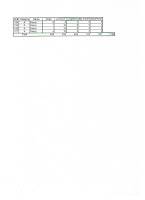
data sheets mk 2
0 comments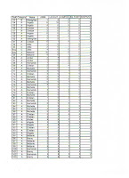
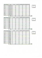
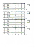
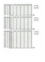
Posted by Kungal at Wednesday, February 11, 2009
bg painting tracking plan
1 commentsstep 1:
CLICK & FILL - picking from a color palette for each scene it is absolutely imperative that there be NO WHITE DOTS. there are ways to check this quite easily - which involves making a new layer underneath and click filling it BLACK then doing a quick zoom in all over.
HAND IN FOLDER: CF_Scene#_Shot#of#_yourname
step 2:
TEXTURE & TONES (if needed) - i will figure out (with help from cristian hopefully!) a way to upload some custom brushes (texture and size) specifically for certain scenes and environments
HAND IN FOLDER: TT_Scene#_Shot#of#_yourname
step 3:
FINAL LINE - this will be in another custom brush (texture and size) and will just be a matter of free handing (carefully) over certain elements of the environment (a bit tedious, but it's a nice look!)
HAND IN FOLDER: FL_Scene#_Shot#of#_yourname
*folders will be created once we get to that point which will all be in a created folder called BG_PAINTING*
anyway, none of this is written in stone, everything is debatable, and if anyone has any other suggestions, please comment! i'm open!
also, i'm still not sure if you guys want to do this in teams, or everyone does everything. i know everyone probably wants to do a little bit of everything, but personally, for production's sake, it just might be a lot more organized and faster (which might be crucial) as well as end up with a more unified look, if we do this in teams. again, this is just my opinion, but i'm open to other production suggestions.
Posted by gela at Sunday, February 08, 2009
Labels: Production
Logo Design Sketch
5 comments

Kept them loose and cartoon-y. Simple text logo sketches done by hand. Was working on more, but I feel one of these two would be best suited for us as a group.
Posted by Amber Gail at Sunday, February 08, 2009
Basic Title Design
1 comments
 Rough mock-up for title/correction. I like the typewriter vs marker, though the marker should be messier. Used a default marker brush in Painter. I feel it's important to be able to read both the original text and the correction clearly.
Posted by Amber Gail at Sunday, February 08, 2009
Production Chart WIP
0 commentsIt's not completed, but I figure not everybody has this information right now and you should. I haven't finished filling in the workbook column. Ideally would like to identify which scenes are masters, and which reuses refer to which masters. Probably in the notes section.
Hopefully this helps with your planning this weekend for what you will work on Monday.
Posted by Amber Gail at Friday, February 06, 2009
I was asked to upload the pretty colours
0 comments My original image.
 After suggestions from Angela.
 ...let's just do a film noir.
Ecks' chair, the toy cage, and extra mess elements are all missing.
Posted by Amber Gail at Wednesday, February 04, 2009
Labels: Colour, ENVIRONMENT - Kindergarten, STYLE
